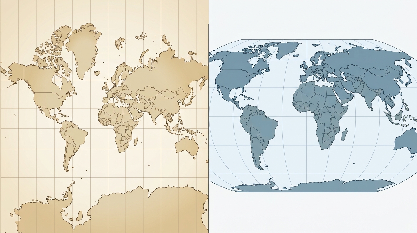
For the last five hundred years, most of us grew up looking at a version of the world that was never quite true. If you went to school almost anywhere on earth, the map on your classroom wall was probably a Mercator projection, and probably nobody ever explained the Mercator map distortion baked right into it. On September 4, 2026, the United Nations General Assembly finally did something about it. Member states adopted a resolution called Correct the Map, pushing schools, governments, media outlets, and tech platforms to stop defaulting to the Mercator projection when they show the world. That is not a small gesture. It is an admission that the map most of us learned geography from was quietly distorting reality the entire time.
The resolution was led by Togo on behalf of the African Union. It is non binding, which means nobody is legally forced to change anything, but it sends a clear signal. Governments, textbook publishers, news organizations, and tech companies are being encouraged to shift toward equal area projections like the modern Equal Earth design instead of Mercator. Togo’s Minister for Foreign Affairs, Robert Dussey, put it simply. A fair map does not change the geography of the world, it changes how we see the world. That line captures the whole story better than any technical explanation could.
So Was the Old Map Actually Wrong?
Not exactly. It was being used for the wrong job.
The Mercator projection was created in 1569 by the Flemish cartographer Gerardus Mercator, and it was built for one specific purpose: sailing. Its real strength is that it preserves angles and shapes, so a straight line drawn on a Mercator map represents a constant compass bearing. For a sailor trying to hold a steady course across an ocean with no landmarks, that was enormously useful. It is a navigation tool, not a picture of the world as it actually looks.
Here is the catch. You cannot flatten a round sphere onto a flat sheet of paper without breaking something. This is not opinion, it is math. Carl Friedrich Gauss proved this centuries ago. Something always has to give when you turn a globe into a rectangle. Mercator chose to protect shape and angle, and the price for that was size. The map stretches landmasses more and more as they move away from the equator and toward the poles.
That single design choice is the whole Mercator map distortion in a nutshell, and it has consequences that go far beyond cartography class.
The Size Lie Most of Us Never Questioned
Look at a standard Mercator map and Greenland looks roughly the same size as the entire continent of Africa. In reality, Africa is about 30.3 million square kilometers. Greenland is about 2.16 million square kilometers. Africa is fourteen times larger. You could fit the continental United States, China, India, Western Europe, and Japan inside Africa and still have room left over.
This is not a minor rounding error. The regions sitting near the equator, meaning Africa, Latin America, South Asia, and Southeast Asia, get visually shrunk. Meanwhile North America, Europe, and Russia get visually inflated. Because this map became the default wall chart in classrooms, newsrooms, and digital platforms across the globe, generations of people absorbed a version of the world where the Global South looks smaller and less significant than it actually is, and the countries that colonized much of it look bigger and more dominant.
Meet Equal Earth, the Map That Fixes the Size Problem
Cartography runs on a strict rule. On a flat map of a round planet, you can preserve true shape or you can preserve true area, but never both at the same time. Mercator chose shape. Equal Earth chooses area, and it does it in a way that finally looks natural.
There was an earlier attempt at solving this called the Gall Peters projection. It got the land sizes right but stretched continents vertically around the equator until they looked oddly elongated, almost like they were dripping down the page. It corrected one distortion by introducing another.
Equal Earth, created in 2018 by cartographers Bojan Šavrič, Tom Patterson, and Bernhard Jenny, was built specifically to solve that problem. It uses curved outer meridians that mimic the curve of an actual globe, which keeps continents looking recognizable and natural instead of stretched. Shapes near the far edges get slightly slanted, but the landmasses in the center of the map keep proportions that look right to the eye. The latitude lines stay straight and parallel, which makes it easy to compare countries sitting at similar latitudes across different continents. It is, in short, the first widely adopted map that manages to be both mathematically honest and visually comfortable at the same time.
The Countries That Change the Most on Paper
Once you switch from Mercator to an equal area map, the visual shift is not subtle. Because Mercator’s distortion multiplies the farther you get from the equator, the countries sitting at high latitudes shrink the most, and the countries sitting near the equator grow the most.
The nations that shrink the hardest once you correct the map:
- Greenland. The most extreme case of all. On Mercator it looks about the same size as Africa. It is actually fourteen times smaller.
- Russia. Still the largest country in the world once corrected, but nowhere near as dominant looking. In real terms it is roughly half the size of Africa, not the continent devouring landmass Mercator makes it look like.
- Canada. Appears bigger than South America on Mercator. South America is actually nearly twice the landmass of Canada.
- The United States, specifically Alaska. On Mercator, Alaska alone looks about as large as the entire lower 48 states, or as large as Brazil. Brazil is nearly five times bigger than Alaska.
- Norway, Sweden, and Finland. These countries appear roughly double their real proportional size next to equatorial neighbors.
And the nations that grow the most once the map gets corrected:
- The Democratic Republic of the Congo and Algeria. On Mercator, the DRC looks smaller than Greenland. It is actually larger than Greenland on its own.
- Brazil. Regularly appears smaller than Canada or Russia on classroom maps, but it actually covers more land than the entire contiguous United States and dwarfs Western Europe.
- India. Looks about the same size as Scandinavia on Mercator. It is actually more than three times the size of Norway, Sweden, and Finland combined.
- Indonesia. Its island chain looks compact and modest on Mercator. Stretched out on an equal area map, it spans a distance wider than the continental United States.
- Ecuador, Colombia, and Kenya. Sitting directly on the equator, these countries take the maximum visual suppression under Mercator and see the biggest correction once it’s gone.
What About Pakistan
This one hits close to home for me, so I looked into it specifically. Pakistan does not stay the same when you move off Mercator. It grows, and more than you would expect.
Pakistan sits between 24 and 37 degrees north latitude, which is far enough from the equator that its distortion is not as extreme as Indonesia’s or Kenya’s, but far enough south that the correction is still very real. On Mercator, Pakistan looks roughly the same size as France or Germany. In actual land area, Pakistan covers about 881,913 square kilometers. France covers about 551,000. Germany covers about 357,000. Pakistan is significantly bigger than France and more than double the size of Germany, none of which comes through on the map most of us grew up with.
Compare it to the United Kingdom, sitting up around 50 to 60 degrees north, and Pakistan is 3.6 times larger than the entire UK, even though Mercator makes the UK look like the more substantial country. Compare it to Texas, and Mercator makes Texas look bigger than Pakistan. In reality Pakistan is about 25 percent larger than Texas.
None of this changes a single physical border. It just changes what your eyes have been telling your brain for your entire life.
Why This Feels So Strange the First Time You See It
Here is the part I find genuinely fascinating. Amazing, and a little unsettling. It is a drastic change, but the first time you look at an equal area map, something in your gut says it looks wrong. Not because it is wrong, but because we spent our entire childhoods memorizing a distorted ocean navigation tool as if it were the literal shape of the world.
A few things are happening at once. We learn continent shapes and sizes by sight, not by measurement, so shrinking Greenland down to its true size, smaller than Algeria, or watching Africa stretch out to dominate the middle of the map, disrupts five hundred years of visual habit in a matter of seconds. There is also a simple psychological effect at play. Bigger objects on a page pull the eye and read as more important. So shrinking the high latitude Western nations while nearly doubling the visual weight of South America, Africa, and South Asia quietly resets how people perceive global scale, trade, and population balance, even if nobody says a word about it out loud. And there is a real design tradeoff too. Equal Earth curves its longitude lines near the poles to keep area accurate, so countries near the left and right edges of the map look slightly tilted. That curve feels strange if your eye is used to Mercator’s clean, square grid.
Once your brain adjusts to the real proportions, though, going back to a classroom Mercator map starts to feel like looking into a funhouse mirror.
The Part That Goes Deeper Than Cartography
Here is what struck me the most while I was reading through all of this. In the traditional Western telling of history, the West is almost always shown as bigger, smarter, more advanced, more moral, and more heroic than everyone else. And most importantly, as the savior. Maps are just one small piece of a much bigger pattern, one that sociologists have studied for decades under names like Eurocentrism and orientalism.
When a culture holds economic, military, or technological dominance for a long enough stretch of time, it controls the tools that shape global storytelling. School curricula. Media production. Global publishing. Visual design, including the maps hanging on classroom walls. And almost without exception, whoever is holding the pen writes themselves as the hero of the story. Putting Europe in the top center of the map and visually inflating its physical size was never framed as a political choice. It was just presented as the map.
That same instinct shows up everywhere else too. Colonial expansion got rebranded as a civilizing mission, a noble duty to bring law, order, and progress to the rest of the world, rather than what it actually was, which was resource extraction and conquest. Hollywood built an entire genre around the white savior trope, where Western characters consistently show up as the ultimate problem solvers and liberators rescuing local populations who apparently could not manage on their own. Historical curricula minimized major global achievements, things like the Islamic Golden Age, Chinese technological innovation, and ancient African urban centers, and instead framed human progress as a straight line running almost exclusively through Greece, Rome, Western Europe, and North America.
That is starting to shift now. Global streaming platforms and international cinema are putting non Western stories in front of global audiences at a scale that was never possible before. Local historians across South Asia, Africa, and Latin America are documenting pre colonial trade networks, systems of governance, and intellectual achievements from their own perspective instead of through a colonial lens. Education systems are increasingly teaching people to actually recognize bias and framing when they see it in news coverage, textbooks, and pop culture. As access to global communication levels out, the narrative naturally expands to reflect how complex and multipolar the world actually is and always was.
Not Every Empire Wrote History the Same Way
Here is something worth sitting with. When the Arabs took over large parts of the Arab world, Turkey, and parts of Europe, they did not go around burning the historical records of the cultures they encountered. They did not erase the achievements of other peoples or try to claim credit for work that was not theirs. They absorbed it, studied it, and built on it. India largely did the same, staying within its own borders for most of its history rather than expanding outward and rewriting everyone else’s story. China followed a similar pattern. These were not passive civilizations. They were simply not in the business of erasing everyone else’s contributions to make their own look bigger.
The Abbasid Translation Movement in Baghdad, running from roughly the 8th to the 10th century, is the clearest proof of this. Scholars there actively translated Greek, Persian, Sanskrit, and Syriac texts into Arabic. They preserved that knowledge and expanded on it instead of suppressing it. Scholars of the Islamic Golden Age like Ibn Sina, known in the West as Avicenna, Ibn Rushd, known as Averroes, and Al Biruni, openly cited classical Greek philosophers like Aristotle and Plato alongside Indian mathematicians like Brahmagupta. Knowledge was treated as one long cumulative human project, not a competition over ownership.
Compare that to what happened when European scholars during the Renaissance translated those same Arabic scientific texts into Latin. Many of the original scholars’ names were systematically Latinized. Ibn Sina became Avicenna. Ibn Rushd became Averroes. Al Khwarizmi, the man whose name literally gave us the word algorithm, became Algoritmi. Al Razi became Rhazes. Some of that was probably natural linguistic adaptation for Latin speaking scholars at the time. But the long term effect on Western education was real. It obscured the Arabic and Islamic origins of foundational work in algebra, medicine, and astronomy for generations of students who never learned where any of it actually came from.
The moment European powers took control on a global scale, starting around the 16th century, it did not come through a fair fight. It came with broken treaties, manufactured rivalries, and deliberate manipulation. The British East India Company in South Asia and European powers across Africa relied heavily on turning local rulers against each other, exploiting existing regional tensions, and breaking agreements to gain territory without needing large standing armies early on. And unlike empires that simply collected tribute while leaving local customs intact, 19th century European colonialism pushed for total structural transformation. European legal systems replaced local ones. European languages became the sole language of administration. Education systems were reshaped to create administrative classes dependent on the colonizer and to dismantle native governance from the inside out. Meanwhile empires like the Ottomans, Safavids, Mughals, and the Ming Dynasty focused mostly on land based regional power and trade networks like the Silk Road. European powers, by contrast, pioneered maritime empire building, which let them project power globally and impose the same economic and educational models across wildly different continents at the same time.
None of the history rewriting that followed was accidental. It was an administrative tool. Standardizing history to center Europe justified the economic extraction of the colonial era under the label of a civilizing mission.
The Brain Drain Nobody Likes to Talk About
Bring this forward to today and you run into a narrative that still gets repeated constantly in Western media and academia, the idea that the West is solely and singularly responsible for modern scientific and technological advancement. That framing ignores both the historical foundations laid by civilizations outside Europe and the actual mechanics of how research and innovation happen right now.
Modern innovation hubs in North America and Western Europe do not run purely on domestic talent. They function as global magnets, powered by selective immigration policy, massive capital concentration, and deep institutional infrastructure. In the United States specifically, foreign born researchers, engineers, and founders play an outsized role in technological breakthroughs. Over 40 percent of Fortune 500 companies were founded by immigrants or the children of immigrants, and a large share of advanced STEM doctoral graduates at Western universities come from Asia, South Asia, the Middle East, Latin America, and Africa. The capitalist system that concentrates wealth in a handful of countries also offers the funding, lab equipment, and institutional freedom that talent from developing nations often cannot access at home. The work happens in the West. The minds doing the work represent the entire planet. Walk into any major research hospital, AI lab, semiconductor facility, or space agency in the Western world and the workforce is visibly international. Breakthroughs credited to a single Western institution are, in reality, the collective output of teams pulled from every corner of the globe.
Crediting global technological progress to one region or one demographic requires ignoring two things at once. It ignores the global foundation the entire system rests on, things like the concept of zero and the decimal system from India, algebra and optics from the Islamic world, papermaking and gunpowder from China, and early agricultural science developed by Indigenous peoples in the Americas. And it confuses geography with identity, treating a discovery made at a university in London, Boston, or Berlin as proof of Western ingenuity, when really it just tells you where the building happened to be located, not where the intelligence behind the work actually came from.
Where This Leaves Us
The shift toward equal area maps like Equal Earth is a small, symbolic reflection of something much bigger. The world is moving away from a single, one sided view of who is capable of what. As global communication keeps leveling out and emerging economies keep investing in their own research infrastructure across Asia, Latin America, and the Middle East, the old concentration of talent and credit in a handful of countries is starting to loosen its grip.
Human progress has always been a cumulative, collective effort built by people across every continent. A map is just paper and ink. But when the whole world has spent five hundred years staring at a distorted one and calling it truth, correcting it is not a small act. It is one small, overdue step toward lining up the story we tell with the reality that was always there.
You might also like this. Global Shifts